Pitch Box
A brand and design system for the RFP-response engine built on one idea: an RFP is a research problem before it is a writing problem. Paper neutrals, one Signal cobalt, and a content voice specified as tightly as the tokens.
Pitch Box turns an RFP into a submission-ready response, drafted from an agency's own facts. It ingests the RFP, builds a dossier on the buying committee, drafts every section from the agency's case studies and knowledge base, then compiles the result into the agency's own branded document, ready for a procurement team. The premise fits in one line: an RFP is a research problem before it is a writing problem. And the product keeps one promise above all others: every number, name, and credential traces back to an entry in the knowledge base. If a fact is not there, Pitch Box brackets it for a human instead of inventing it.
The brand had to encode that promise. This system does: tokens, fonts, components, 2 product UI kits, and foundation specimens.
The system
A control-plane aesthetic that feels precise, calm, and trustworthy. Warm ledger-paper neutrals sit under a single cool electric accent, Signal cobalt (#1E54E8), the same cobalt as the box itself. Status is a grounded / needs-review / gap palette (green, amber, red) with dedicated add and remove diff swatches, because the product's whole job is showing you what is proven, what needs a look, and what is missing.
Monospace is a first-class brand voice, not a code style: source names, IDs, citations, and eyebrows all set in JetBrains Mono, with Schibsted Grotesk carrying display and UI. Numbers read like evidence: tabular, grouped, with real-looking IDs and UTC timestamps. Status is always a count plus a word. "48 answers drafted. 12 bracketed for review."
The signature form is the box, an isometric parcel: the whole response, packed and submission-ready.
The content system
This is where Design & Content earns its ampersand. The voice is specified as tightly as the color tokens: the calm, specific operator who has lived the deadline scramble. Authoritative and technical, never hypey. It speaks to "you" and "your agency"; the product is Pitch Box, third person, never "we."
The tone rules ship with the system the way tokens do.
- Lead with the specific, high-stakes moment, then the guard. "A 60-question RFP lands Friday; two writers, a blank doc, and the incumbent has a head start."
- Name the source, name the number. "Drafted 48 of 60 answers from your knowledge base; bracketed 12 for a human." Specificity is the brand.
- Grounded, not abstract. The system sells against "Where's the proof for that claim?", never as generic AI for proposals.
- Honest about limits. A fact that is not in the knowledge base gets bracketed, never invented. The copy says so, plainly, everywhere it matters.
Casing, numerals, and vocabulary are all specified: sentence case for headlines and labels, UPPERCASE mono eyebrows with wide tracking, lowercase mono for source names exactly as stored, and a fixed vocabulary from ingest to one-click PDF. No emoji anywhere; status is carried by the traffic-light dots.
The recycle
The honest part of this story: the system foundations were recycled from a prior product, a CRM change-control tool called Changebase. This pass is the identity rebrand. The mark, the name, the brand and type specimens, the token labels, and the documentation are Pitch Box; the product components and both UI kits deliberately still wear the prior product's demo content, kept as working demos for a later content pass.
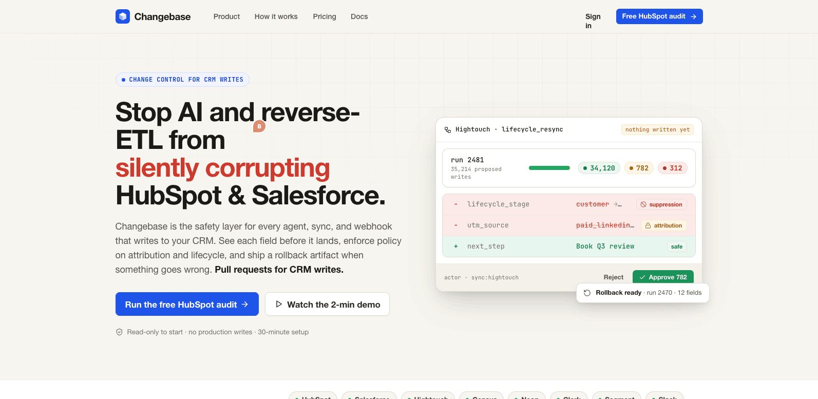
A design system is supposed to outlive its first product. This one already has: the palette mapped onto the inherited foundations 1:1, and the rebrand pass touched identity without breaking a single working component.
Where it stands
The v1 identity is shipped: tokens, fonts, components, both UI kits, the foundation specimens, and the brand's explainer video, documented end to end. Next pass: re-skinning the kit demo content into the RFP domain. The system's own bar applies to the system itself. Grounded, specific, and honest about what is not done yet.